Hendi App
Apps – UX/UI/IxD
---
About the project
Concept app –
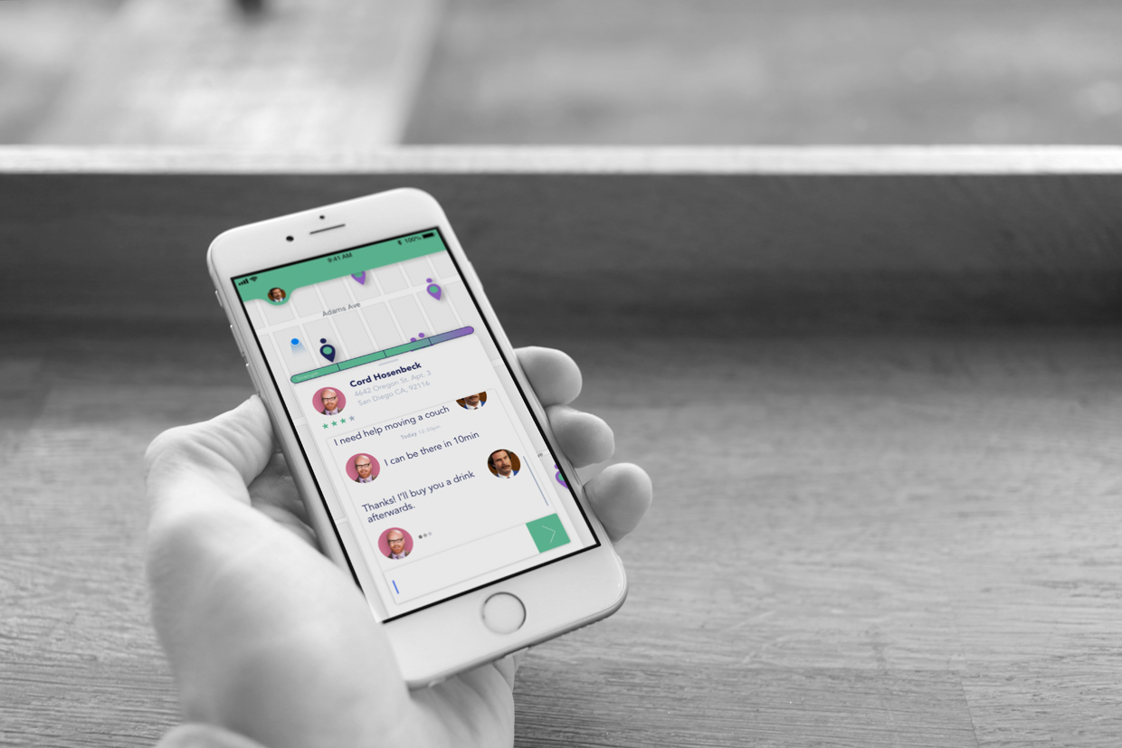
Hendi is your trusted local neighborhood app that allows you to find the right help when you need it. Are you moving in or moving out? Do you need help moving that heavy couch? How about that big bed? Hendi has the answers to those questions with a simple tap on a screen.
Target demographic
Through some careful analysis on the type of users that currently use the popular ride-sharing apps, it was determined that they are the ideal target audience for this app.
My role on the project
- User Experience Design
- User Interface Design
The tools
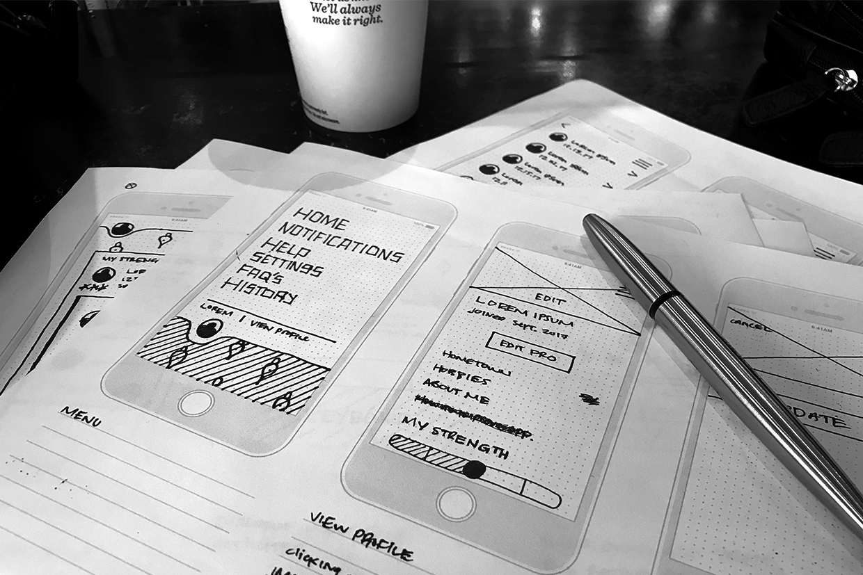
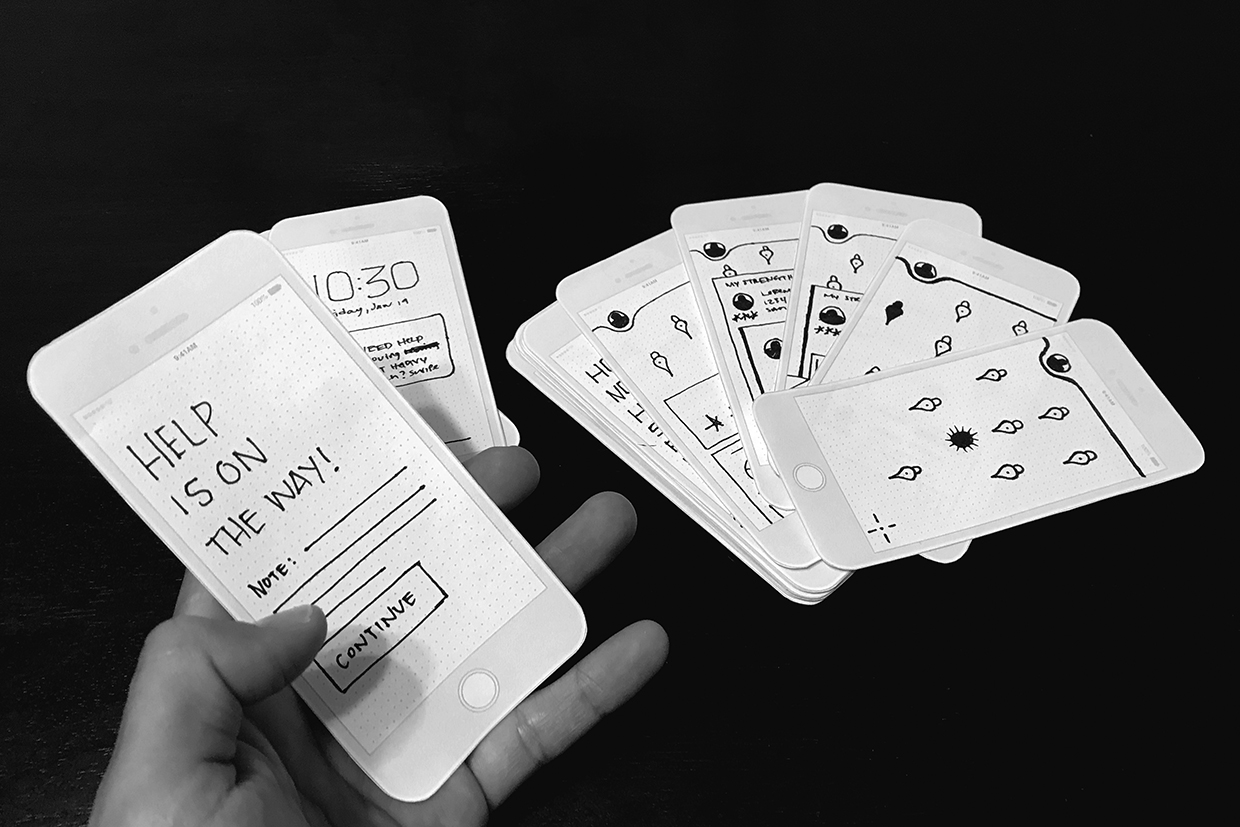
- Paper and pencil for quick low-fidelity ideation
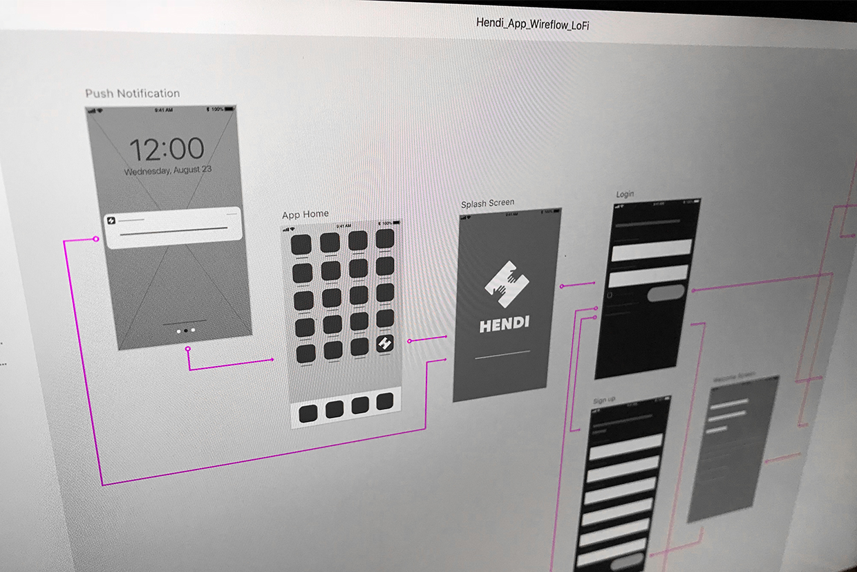
- Adobe XD for mid-fidelity wireframes and high-fidelity final designs
- InVision for prototyping
The Problem/Challenge
Sometimes our friends and family are not there when we need that “on-demand” help. People are becoming more and more reliant on “on-demand” services, so there currently is no such application that allows people to find that lending hand at the tap of a screen. So how do you allow people to access the help they are looking for when they need it the most?
The design solution
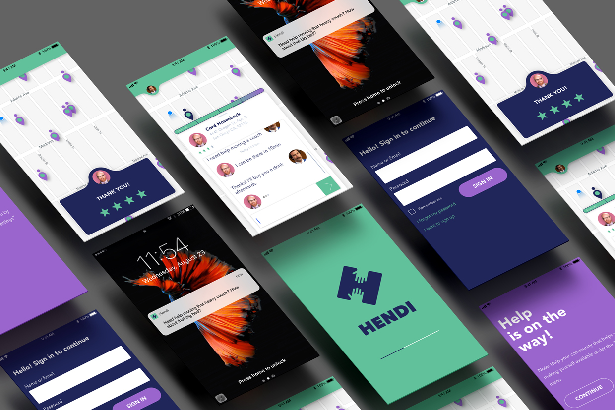
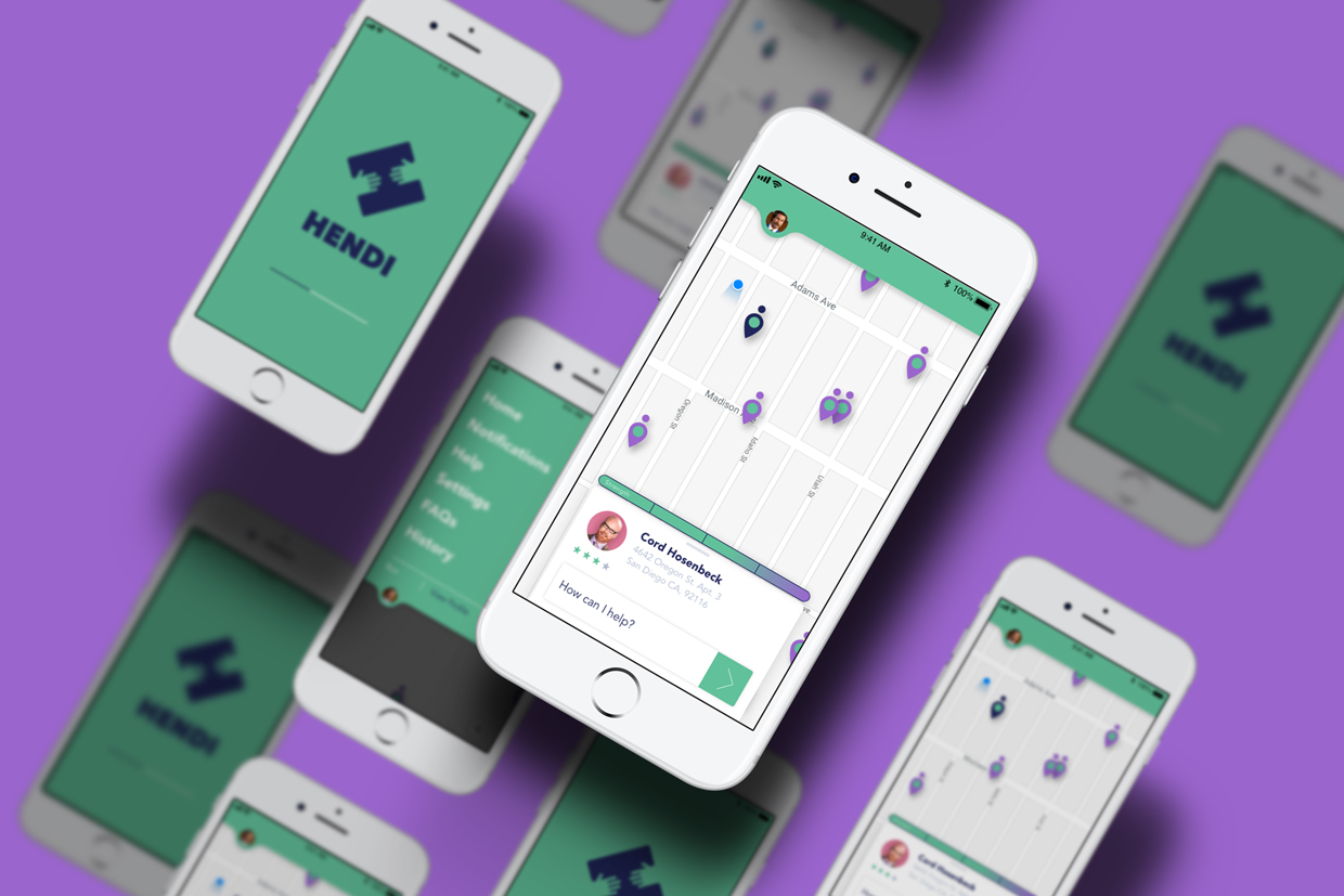
Create an app. Not just a listing, but give the users the ability to interact, to see where and how long the help will take to get there. Give users the ability to also message their help for communication purposes. And last but not least, allow the users to rate their help since it establishes credibility and builds trust amongst the community.
User story
As Ron, I want to find someone that can help me move out of my apartment, so that I can settle in and enjoy my new location.
Jobs to be done
When I am moving out of my apartment/house, I want to be able to contact someone quickly so I can get an extra hand in moving my furniture.
Ideation
Sketching
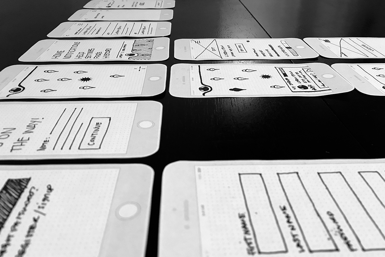
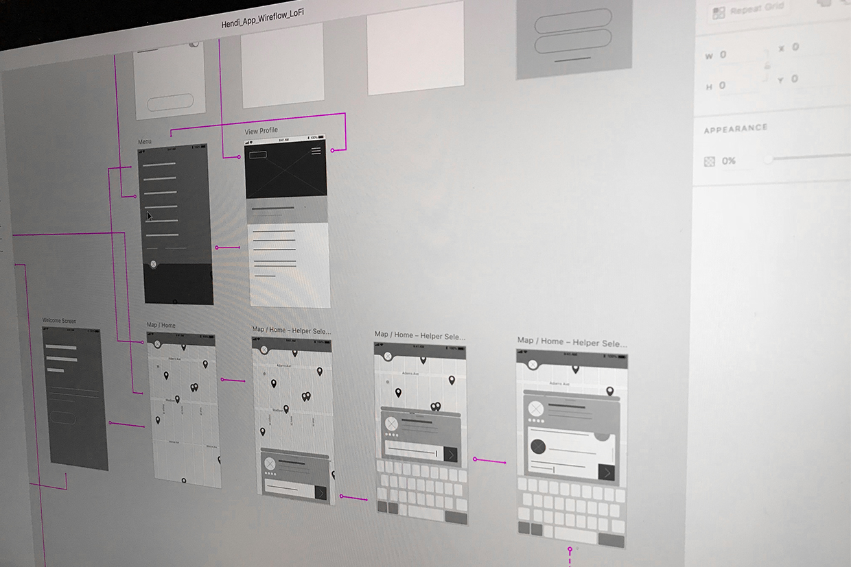
I usually start my design process with low fidelity wireframes, which allows me to iterate and pivot through many design options quickly. Through this sketching process, I can also pinpoint and diminish the amount of interactions the user needs to get to a specific destination.
Wireframing:
After I have a sketch that's sound, I create mid-fidelity wireframes using the Adobe XD software. This method gets the product one step closer to the final end product by getting a good feel for elements and content.
Design:
- The user interface took a flat, clean and minimalist approach.
- The colors used for the app have a muted and relaxed feel.
- The platforms to design this app were Adobe XD and Illustrator.
- The brand identity for the app portrays two hands carrying a box that shape the capital letter “H”.
